

Hotel App Redesign
UX/UI Design
Choice Hotels
In 2024, the Choice Hotels app team took on the monstrous task of redesigning both the iOS and Android apps. My role on the mobile apps team was to work on bringing this dream to reality from discovery to launch. The two of us designers on the mobile app design team - along with some outside help from an amazing local designer and digital agency - reimagined what the Choice Hotels mobile app experience would look like.
-
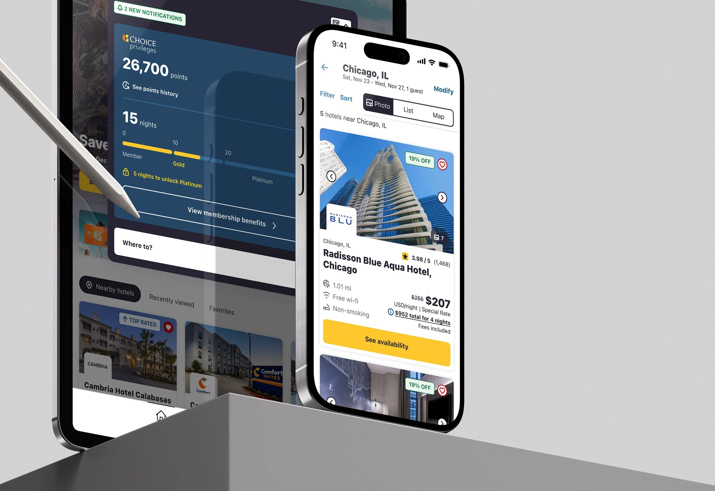
![An image of a hotel tablet and phone app]()
Every aspect of the mobile apps on iOS and Android was updated. Over 1,600 screens had adopted the new design system.
-
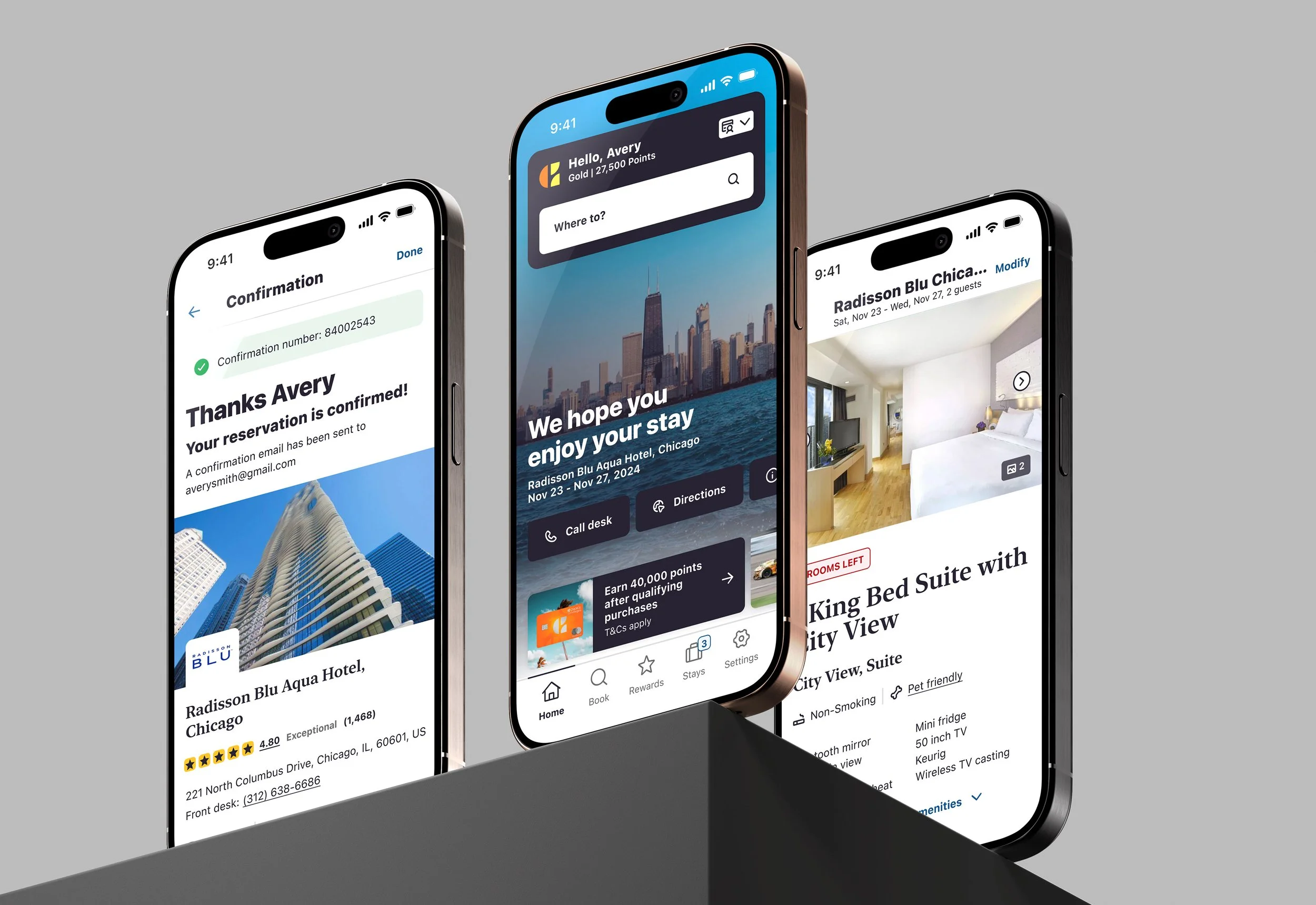
![An image of phones and a tablet on glass]()
We took the time to make small adjustments to the interactions as well, like a new gallery, clearer tap areas, and pulling in more information on the hotels.
-
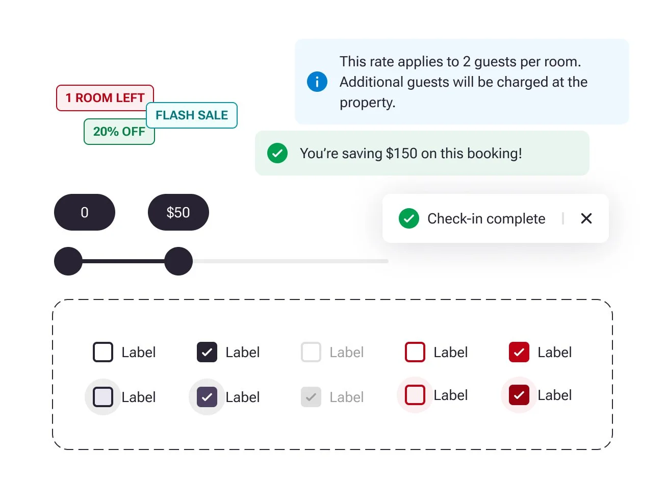
![An image of three phones on a ledge]()
The design was the first time in over a decade that the mobile app and website booking experiences were aligned in a unified system.

Complete design system
The core of this project was a new design system that the mobile apps team developed alongside the web team and our agency partner. Us app designers built our own Figma components for both iOS and Android using the Atomic Design structure while making sure it was visually aligned with what we curated with parallel teams.
For me, this was the first time using Figma to create this type of system of reusable components. It was a blast creating and saved us so much time when we moved to piecing the screens together.
Out with the old, in with the new.
Out with the old, in with the new.
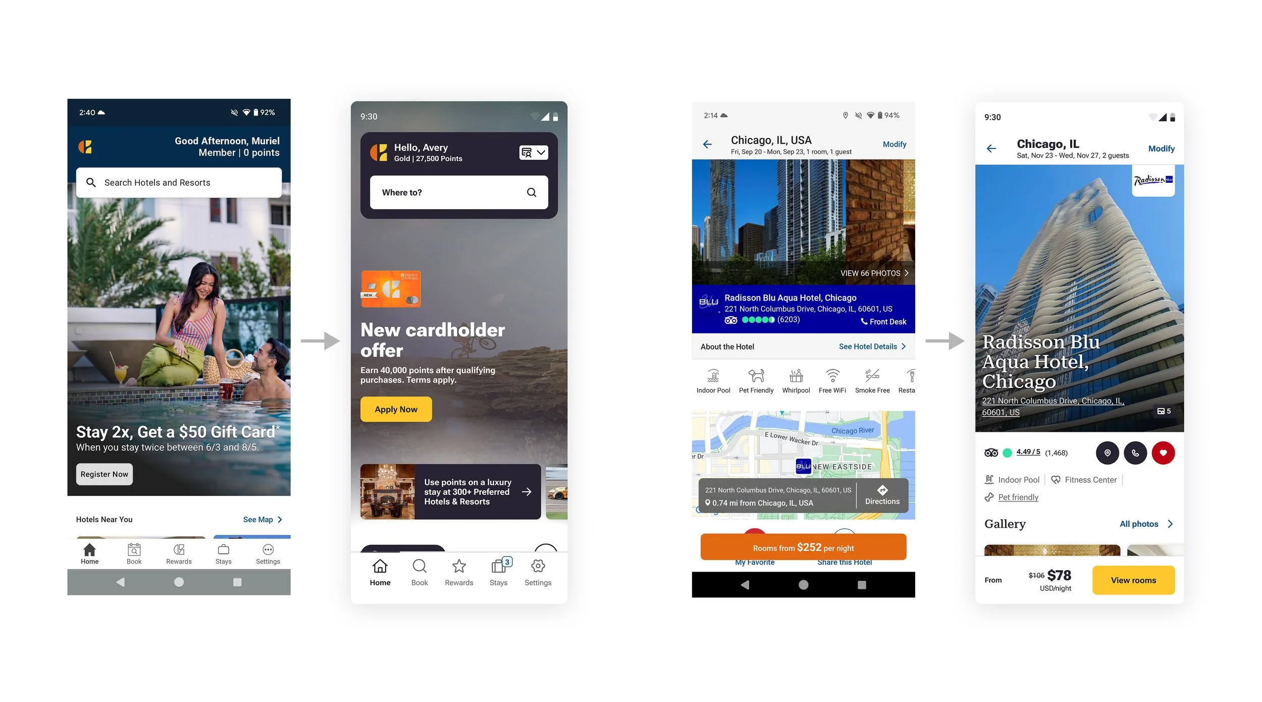
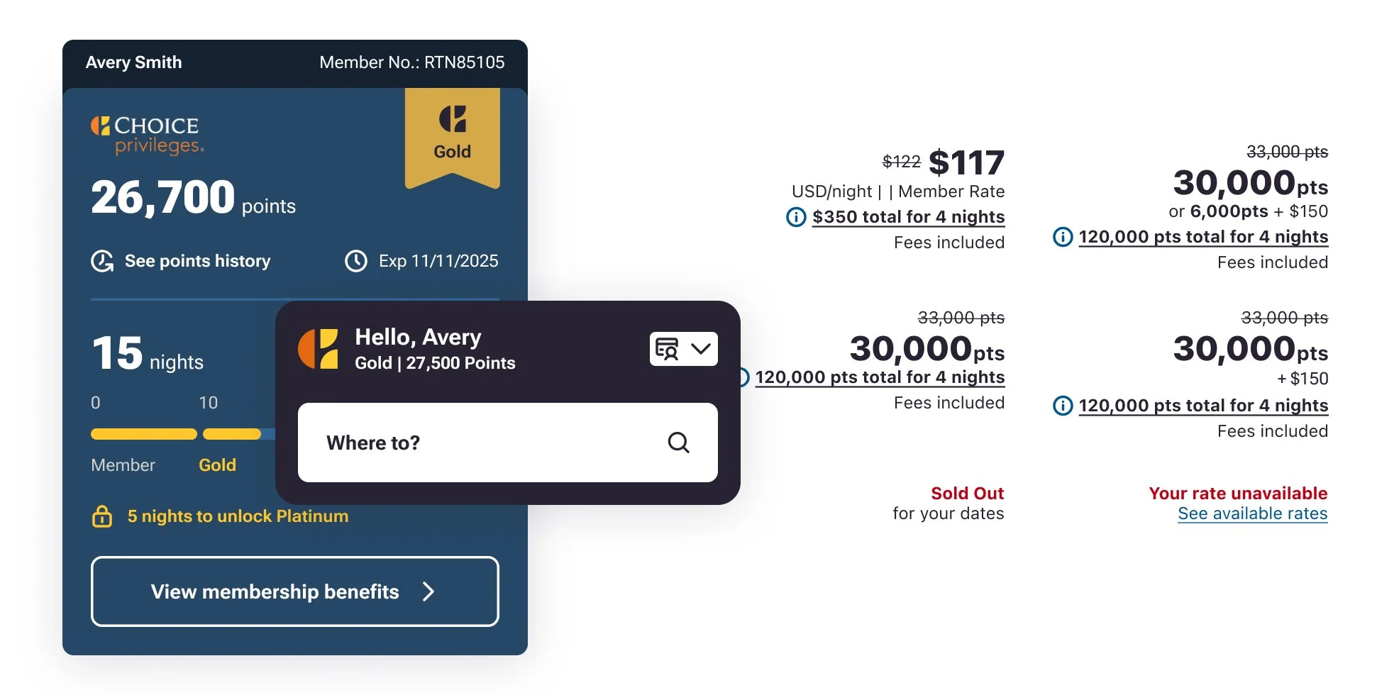
This side-by-side comparison of the old (left) and new (right) for the home and property screens shows just how dramatic of an improvement this redesign was. Showcasing hotels with larger photos, creating easy-to-interact cards, and adding more breathing room for all the elements in the apps design was critical.