Mobile App Notification Center
Product Design
Choice Hotels
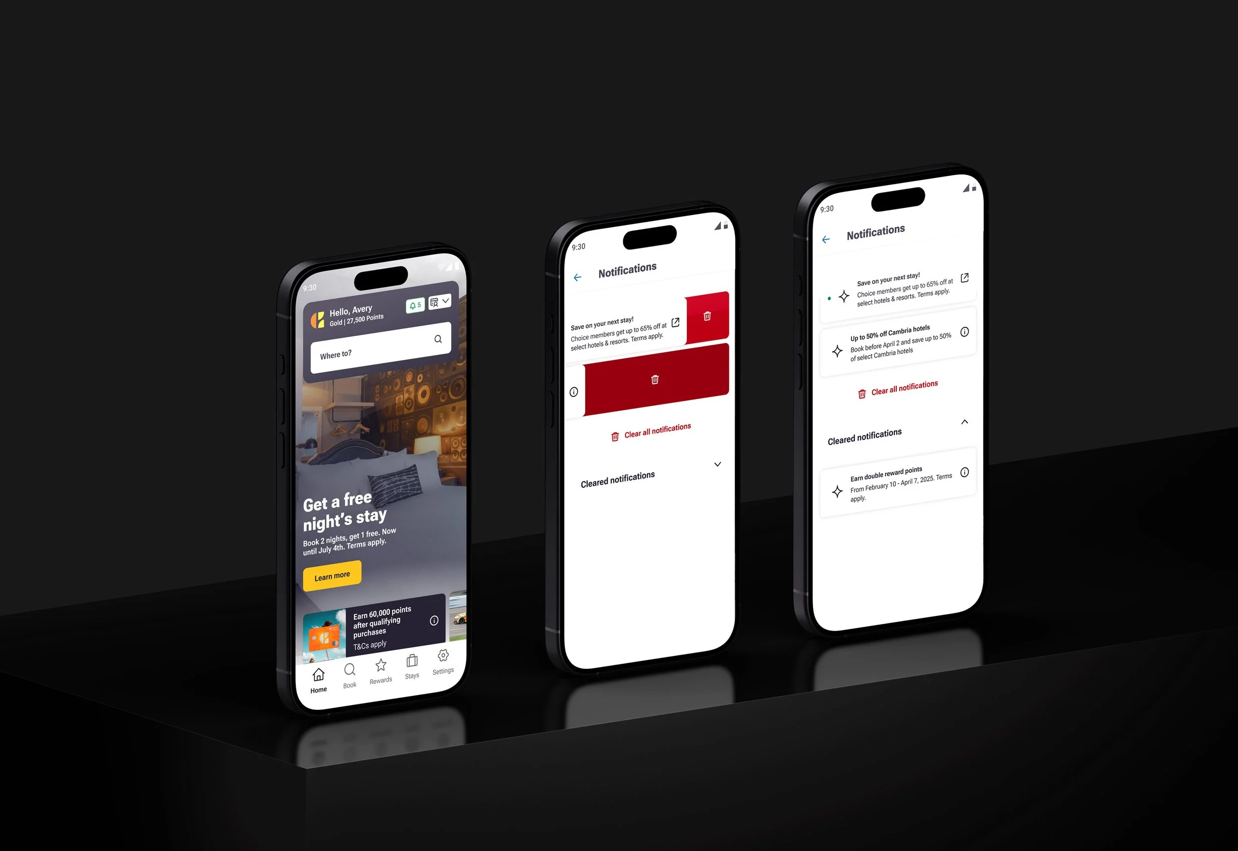
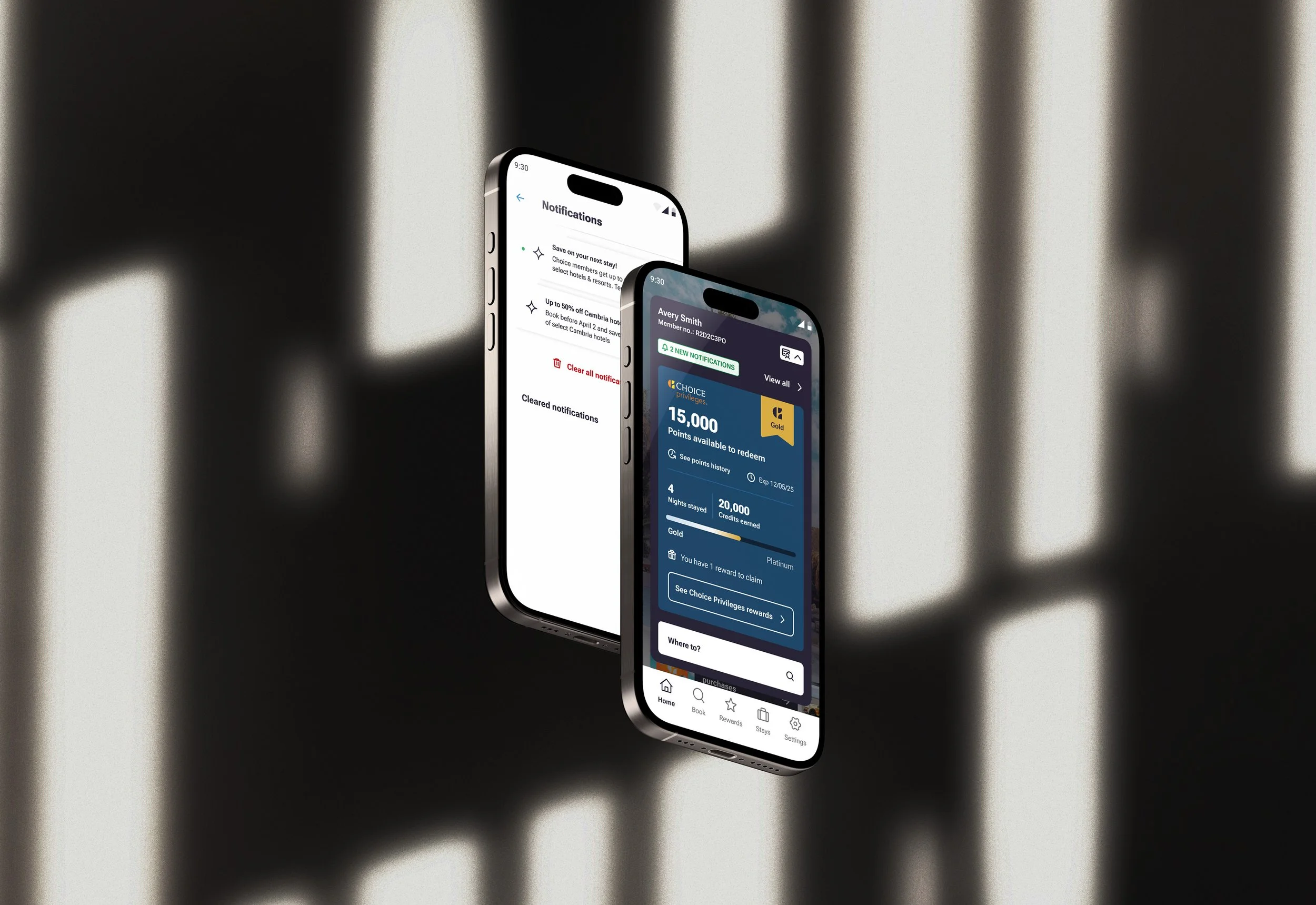
Something that rides a fine line between being useful or annoying is notifications in our mobile apps. For Choice hotels, I had to find the balance of being useful to our guests with relevant notifications, while also making sure we don’t overload them with too many alerts. This new feature of a “Notification Center” would help organize all the app notifications in one place that was easy to access but never in the way.
The perfect balance
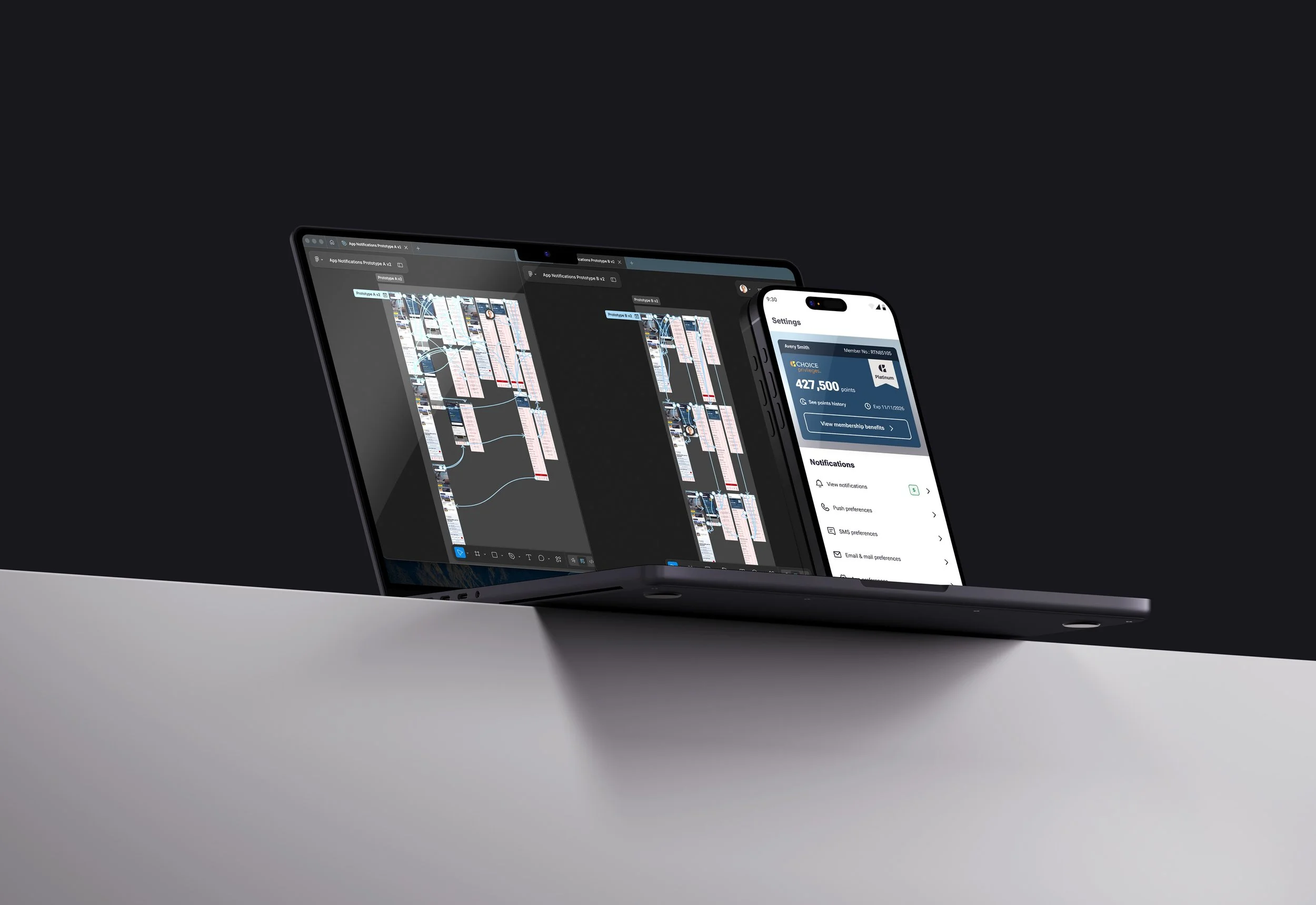
User testing happened in a couple rounds as there were a multiple ways I wanted to see how people would react to placements, emphasis, and styling of notification alerts throughout the app. The results were mostly predictable but testing was still necessary to validate any assumptions.
Prior to user testing I pulled in some recent interviews with users on travel apps and websites overall. This had some nuggets of information around when they actually cared about updates on their bookings or reservations.
Most travelers

turn off all travel app notifications until the days leading up to their trip
Notifications should be beneficial to the actual travel experience
We started A/B testing for this feature with promotions and membership information at the forefront. These types of notifications were the quickest way to get things tested and gather the needed quantitative data.
This is also a stress test with the most annoying types of notifications - promotions. Will these be helpful? Will having a centralized location to come back to these promo notifications be well received by the budget traveler? Did we nail the balance of access but not intrusive? Time will tell.
There’s a much grander plan for building out this new feature in the app, but you’ll have to wait until things launch to see what it is.