The logged-in experience of SilverSneakers.com has provided a few benefits throughout the years for SilverSneakers members. From tracking gym visits, to downloading their member ID card, the dashboard is meant to be the hub for all exclusive content that comes with a membership. Our product team at Tivity Health reimagined that logged in experience to make it a transformational tool instead of being purely transactional.
My Role
Client
Website
How might we create a continuously valuable online experience for our 15 million SilverSneakers members that would drive more return visits? Previously, the dashboard provided a one-time use of downloading the membership card, then began tracking gym visits for members to see, but it never begged those members to return on a regular basis.
Due to the dashboard being around for a while, we were able to bring together a cumulation of past user testing and conduct competitive analysis on other “dashboard” experiences. One thing we noticed while looking at the current assets available in the SilverSneakers site was that the blog and its content was one of the most valuable pieces to seniors.
As valuable as the blog content was, we noticed there were areas to improve returning traffic, as well as an opportunity to feature the hours of exclusive, member-only on-demand video workouts & healthy living tips. This wasn’t just about getting numbers on analytics though, as we knew this content was perceived as valuable when we placed samples of it in previous user tests. There was genuine excitement and "wishing" for this stuff in those tests, people just didn't know it was there already.
The excitement and value was there for seniors, we just needed to help them find it.
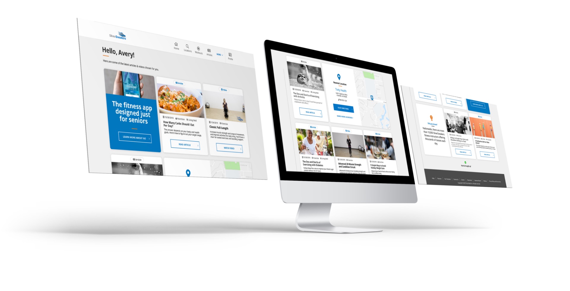
Transform the dashboard by featuring blog and on-demand workout content for users that would refresh every day. This would create a “feed” of valuable articles, workouts, and how-tos that would be specially curated for members only.
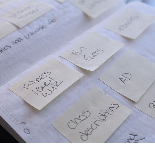
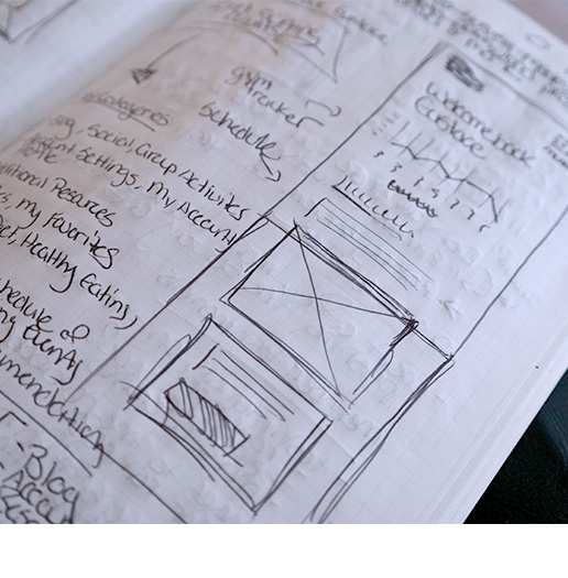
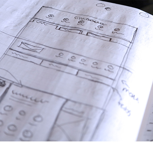
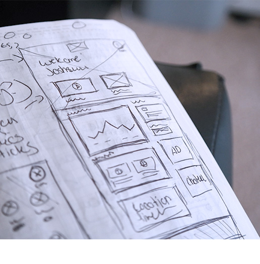
We began creating quick wireframes which we then made interactive to do some rapid user testing. This cycle of testing lasted several rounds until we found the absolute best way to organize the content.
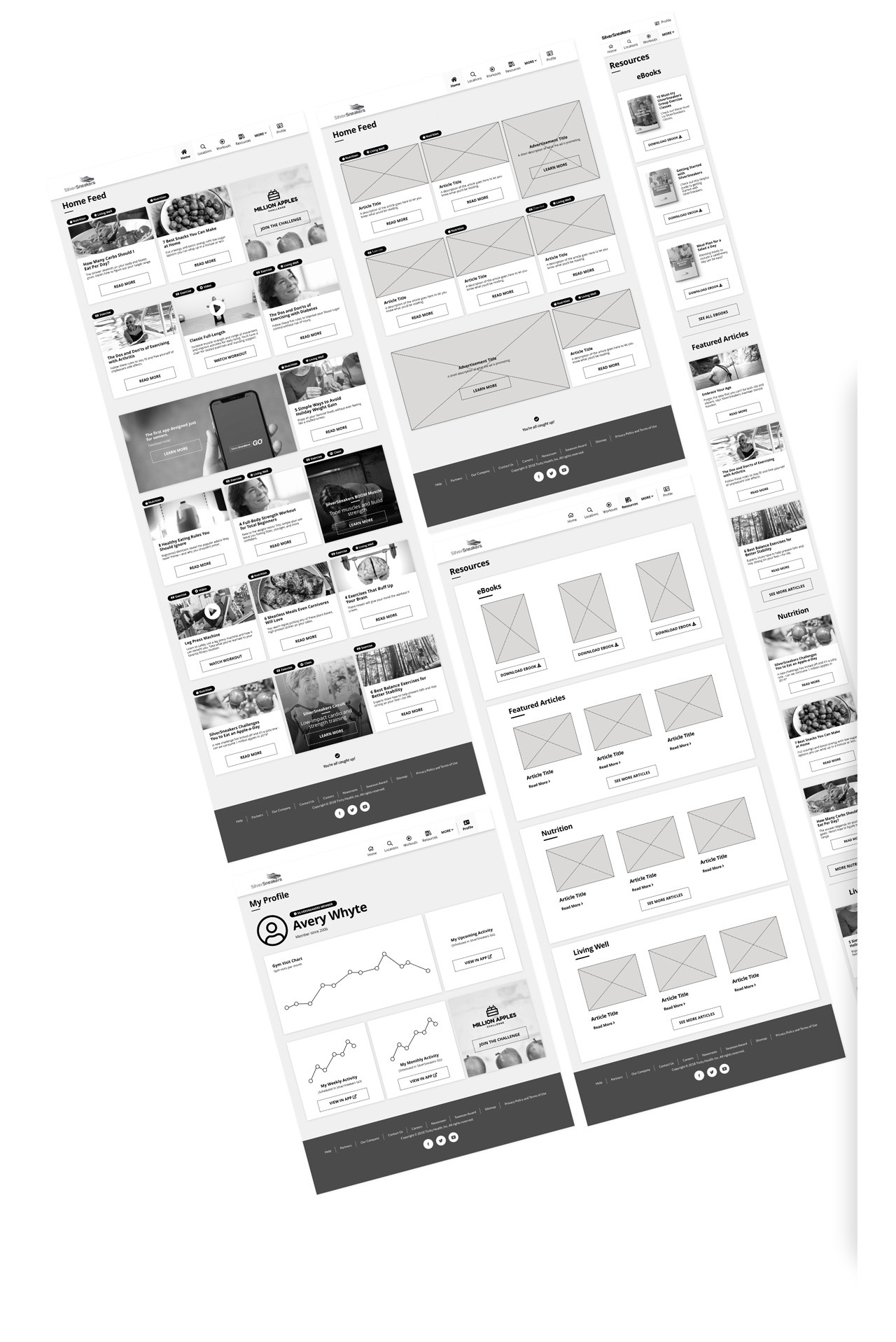
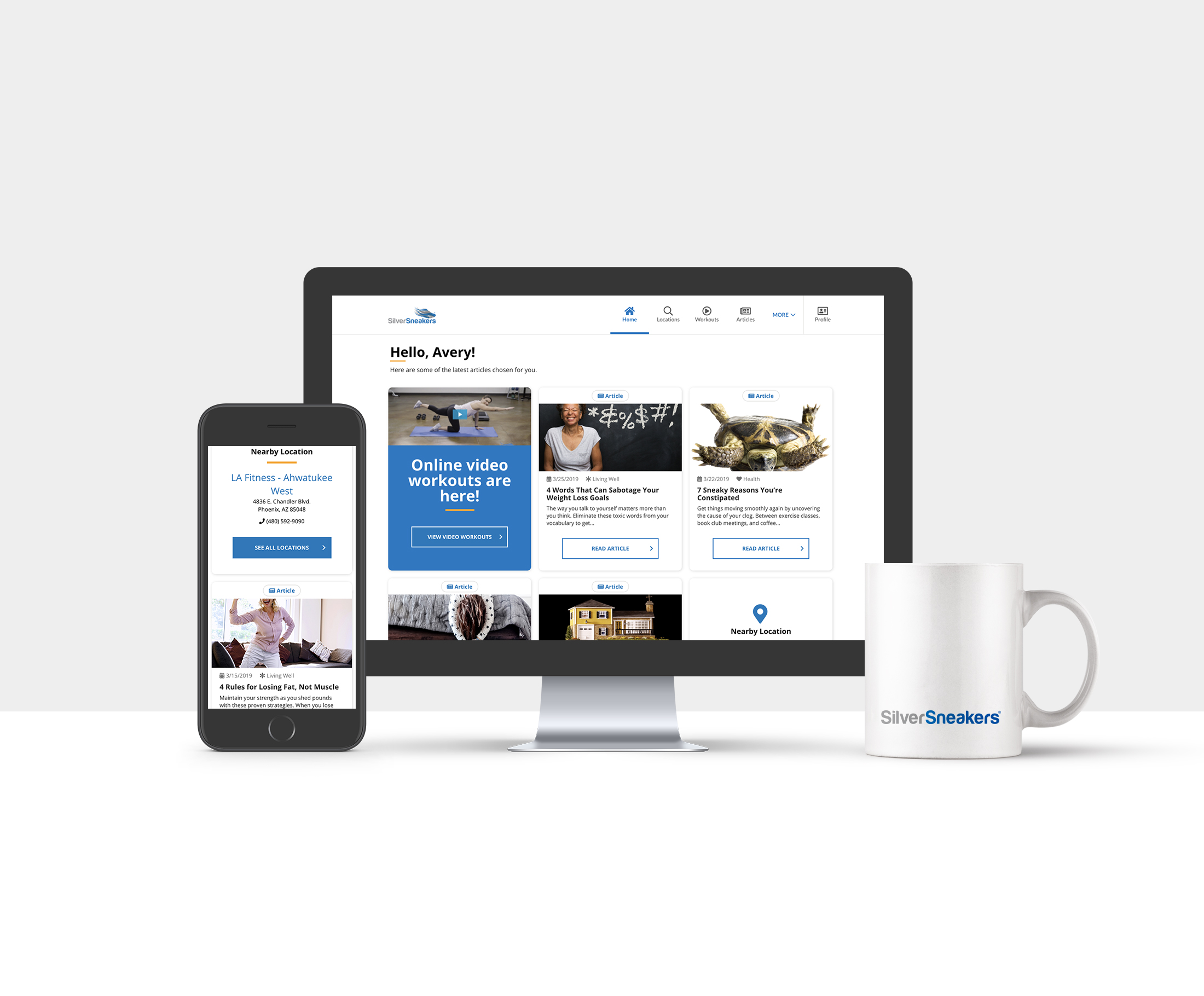
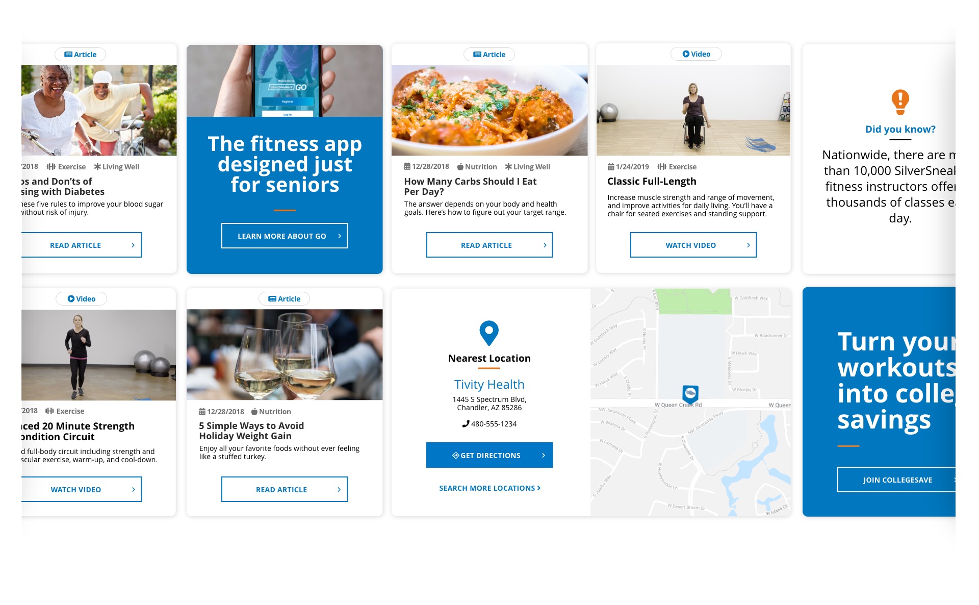
Taking a page out of commonly used social networks like Facebook & Pinterest, we used a card format to curate the content for our users. It’s no secret that Facebook is the number one social network that seniors use with Pinterest close behind, so presenting a dashboard in this familiar format would feel comfortable and familiar.
Since there are new SilverSneakers articles published almost daily, we place those as the main highlight, while sprinkling in the less frequent (for the obvious reasons of production time) exclusive videos of actual full-length SilverSneakers workouts. This balance tested extremely well in our early prototypes showing the value was evenly balanced - it’s easier to read healthy living articles than do a workout.
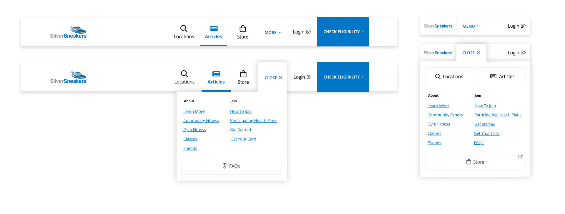
In our early tests we used the previous navigation, which ended up being a nightmare. The navigation had slowly mutated into a mess over the years and the struggle was apparent with our seniors. We took this opportunity to split the project amongst the UX team to overhaul the entire navigation for the site in tandem with the dashboard redesign. Without this restructure and facelift of the navigation architecture, the new dashboard would have surely failed.
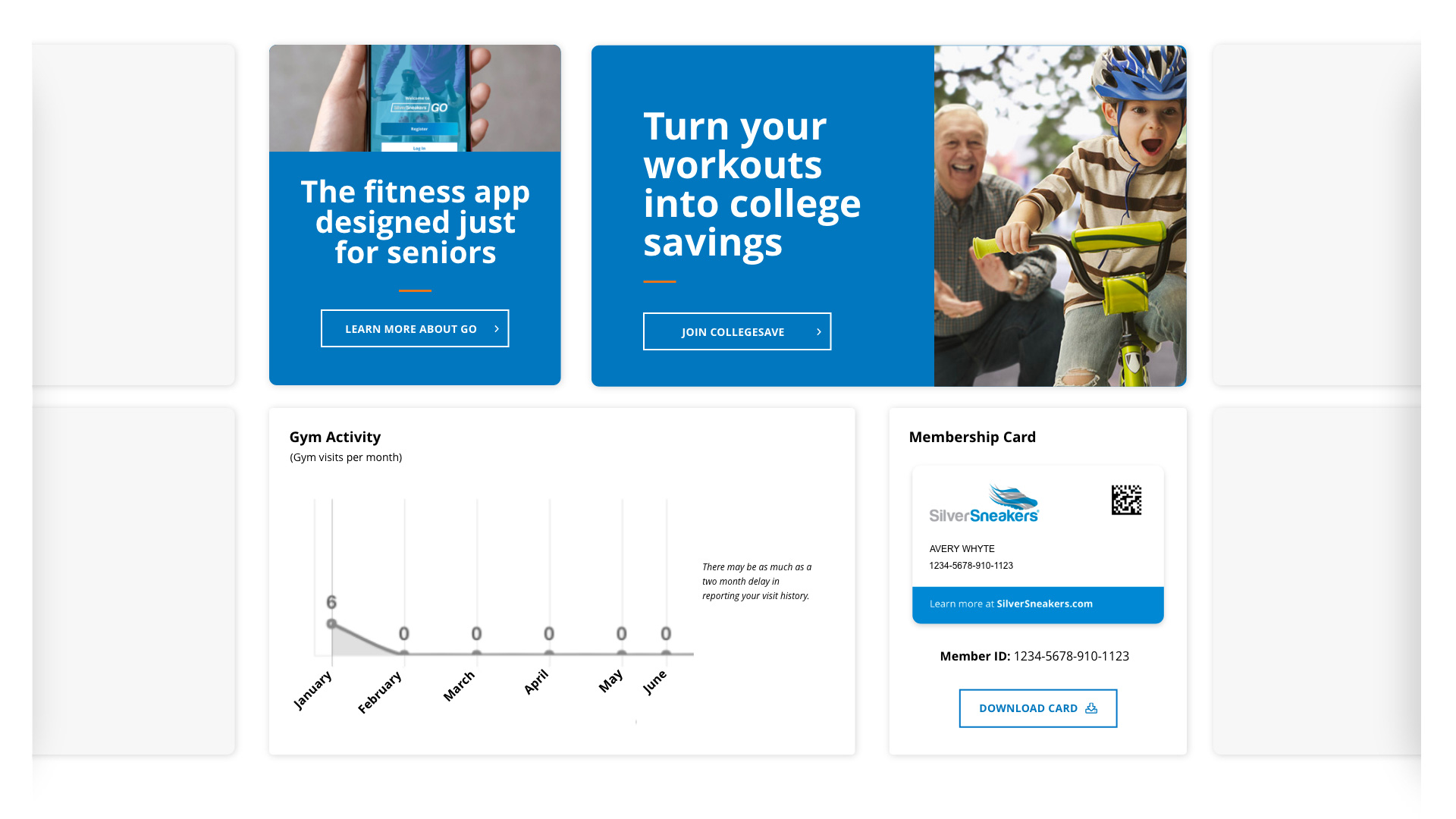
A big benefit of these dashboard-like experiences is that they provide an opportunity to promote similar products by the same brand with high engagement. This was something in the previous design that was good in theory, but had great room for improvement. We wanted the “ads” to be less intrusive and easier to understand while quickly scrolling through.
In addition to the home screen of the dashboard being overhauled, we restructured some items to live in a dedicated Profile section. Now any personal information and statistics like gym visits and membership cards, would be found in an ever evolving profile for the member.
Exact numbers can’t be shared here, but what we can say is that the dashboard so far has been proving itself valuable. Seniors are spending less time aimlessly scrolling around, and more time consuming content or getting to the things they want faster (like the membership card - which was previously hidden down towards the bottom of the homepage).
Fortunately we conducted plenty of prototype tests to launch this new, dynamic dashboard with confidence. Return users have also seen an uptick and are estimated to grow in numbers as even more improvements are on the way.